The design in the interface of a smartphone today can mean the difference between cajoling a user while browsing it or leave you with a face a little discontent at having the idea that it seems that you are playing with a terminal that is already its years old.
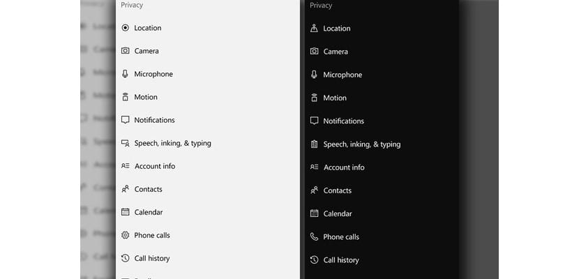
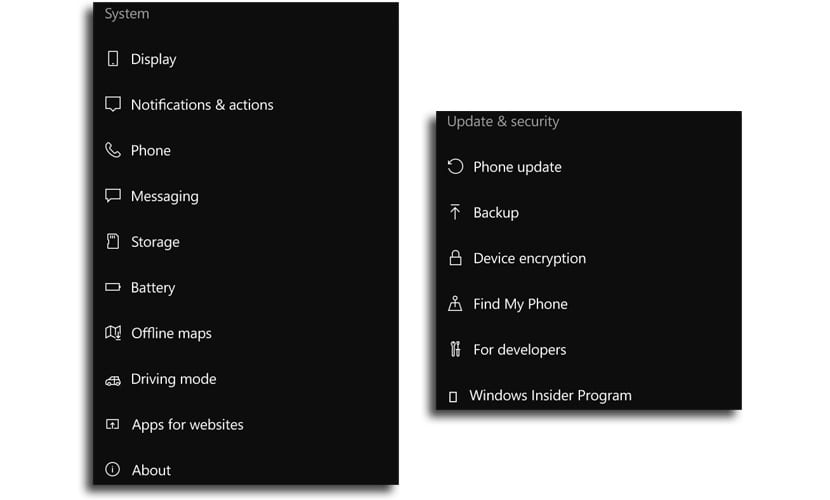
This is where, in a version or build of Windows 10 Mobile it has to be released (specifically build 14342), it has been put a little affection and love from Microsoft with a series of new icons for settings. This update in the design will become part of the Anniversary Update for Windows 10.
As you can see from the shared images, they are a few icons which have been replaced with some that show in a better way what the setting it will take us to when we press it from Windows 10 Mobile.

Possibly this type of news for quite a few years would not need any attention from us, but at the present time design languages are very important to even be able to differentiate different OS or apps. You can have an excellent smartphone with high-quality hardware, but if the interface is a bit old-fashioned and does not measure up, those sensations can be somewhat less, when a great design can mean the finishing touch to offer an outstanding product.
It is also necessary to count on the screens of the devices are of higher quality and the resolution in pixels has increased considerably to present those UI in an almost spectacular way when it is known to integrate a design language such as Android's own with Material Design and the one that now operates in the next Anniversary Update of Windows 10 Mobile.
Finally you can unlink Windows 10 Mobile from those icons more to the design of Metro.